Divider
A divider is a horizontal hairline that separates groups of content. ui.Divider() draws a line one logical
pixel tall in the theme’s separator color.
Use it between blocks in a vertical stack, such as the fields of a form or the rows of a hand-built panel. For a list of rows, use a List instead: it draws its own separators.
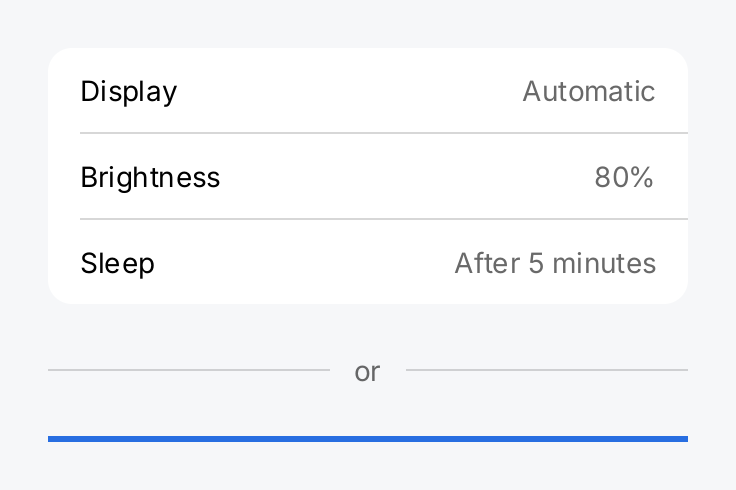
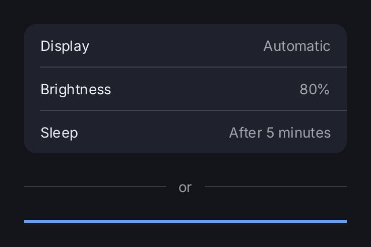
row := func(title, value string) gift.View {
	return ui.HStack(
		ui.Text(title),
		ui.Spacer(),
		ui.Text(value).Foreground(ui.ColorSecondaryLabel),
	).PaddingInsets(geom.Insets{Top: 12, Right: 16, Bottom: 12, Left: 16})
}

return ui.VStack(
	// Inset dividers line up with the text of the rows.
	ui.VStack(
		row("Display", "Automatic"),
		ui.Divider().Inset(16, 0),
		row("Brightness", "80%"),
		ui.Divider().Inset(16, 0),
		row("Sleep", "After 5 minutes"),
	).Background(ui.ColorSurface).CornerRadius(12),

	// In an HStack a divider needs a flex to get a width.
	ui.HStack(
		ui.Divider().Flex(1),
		ui.Text("or").Foreground(ui.ColorSecondaryLabel),
		ui.Divider().Flex(1),
	).Gap(12).Align(geom.Center),

	// A thicker line in the accent color.
	ui.Divider().Thickness(3).Color(ui.ColorAccent),
).Gap(24).Frame(320, geom.Unbounded())
Full demo on GitHub ↗
· run it with go run ./docs/gallery -demo divider
Usage
It fills the width it is offered. Like a box, a divider takes the full width on a bounded axis and none on
an unbounded one. In a VStack it spans the stack. An HStack measures its inflexible children with an
unbounded width, so there a divider has no width until you give it a flex:
ui.HStack(
	ui.Divider().Flex(1),
	ui.Text("or"),
	ui.Divider().Flex(1),
).Gap(12).Align(geom.Center)
There is no vertical divider.
Inset aligns it with the text. Inset(leading, trailing) shortens the line at both ends, in logical pixels.
Use the same leading value as the padding of your rows, so the line starts where the text starts. Both values
must be finite and not negative. An inset larger than the width draws nothing.
Thickness and color. Thickness sets the height in logical pixels and panics unless the value is finite and
positive. Color replaces ui.ColorSeparator. A semantic color follows the theme, so prefer one of those over
a fixed color.
Space around it comes from the parent. A divider has no padding or frame modifiers. Set the spacing with the
Gap of the surrounding stack, or with the padding of its neighbors.
It stays sharp. The layout height is always the logical thickness, at every density. When painting, gift moves the line to whole device pixels, so a hairline never blurs across two pixel rows, also inside a scroll view.
API
Constructors
| Constructor | Description |
|---|---|
func Divider() DividerView | Divider returns a hairline of DividerThickness in ColorSeparator. |
Methods
| Method | Description |
|---|---|
Color(c Color) DividerView | Color sets the colour of the line, replacing ColorSeparator. |
Inset(leading, trailing float32) DividerView | Inset shortens the line at its leading and trailing ends, in logical pixels. |
Thickness(f float32) DividerView | Thickness sets the height of the line in logical pixels. |
Common modifiers: Flex, Key. See Modifiers.